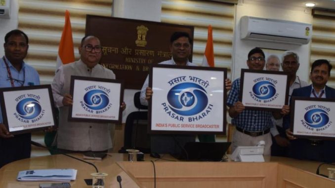
India’s public broadcaster Prasar Bharati released its new logo on Monday.
Headquartered in New Delhi, Prasar Bharati is a statutory autonomous body set up by an Act of Parliament. It comprises of the Doordarshan Television Network and All India Radio (AIR), which were earlier media units of the Ministry of Information & Broadcasting.
According to a statement, “The new logo is replete with rich meaning. The elements in the central circle and map of India signify the service of trust, security, and perfection for the common man.”
“While the elements in the central circle and map of India signify the service of trust, security and perfection to the nation, its colour, ‘Dark Moderate Blue’ represents both the sky and the sea and is associated with open spaces, freedom, intuition, imagination, inspiration, and sensitivity.
Blue also represents meanings of depth, trust, loyalty, sincerity, wisdom, confidence, stability, faith, and intelligence. The colour blue also pays tribute to the Indian ethos and traditions associated with religious figures; mythological characters found in the Indian miniature paintings.”
On the occasion of unveiling of the new logo, Member (Finance) DPS Negi opined that in the earlier format, the corporate office of Prasar Bharati used both AIR and Doordarshan logos on both the sides of the written text ‘Prasar Bharati’ along with the Indian emblem in the middle. Inspired from the identities of both AIR and Doordarshan, the new logo of Prasar Bharati is defined as a blend of both AIR and Doordarshan. It not only encloses the elements from their visual identities, but it also leverages their colour combinations, to complement the identity of Prasar Bharati as a public service broadcaster.
